CityScore
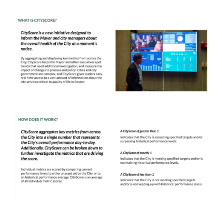
CityScore is an initiative designed to inform the Mayor and city managers about the overall health of the City at a moment’s notice by aggregating key performance metrics into one number. Here we will provide you with an overview of the CityScore tool and data, but more importantly we will show you how we are using CityScore to make improvements across the City.
Role: UX Designer
Responsibilities: user research, user flows, information architecture, wireframes, prototyping, usability testing.
Tools
Sketch
InVision
Zeplin
A Refresh to Bostons Website Highlighting the Status of the City
Intro 👋🏼
The City of Boston department of innovation and technology launched CityScore in early January 2016 with the mission to engage constituents in the city's performance and metrics.
Goals
Challenge 😅
- Increase external user engagement
- Two week design sprint
- Improve site accessibility 💡
- Team of two
The Opportunity 👏🏼
Heuristic Analysis
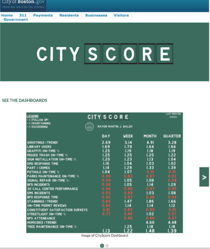
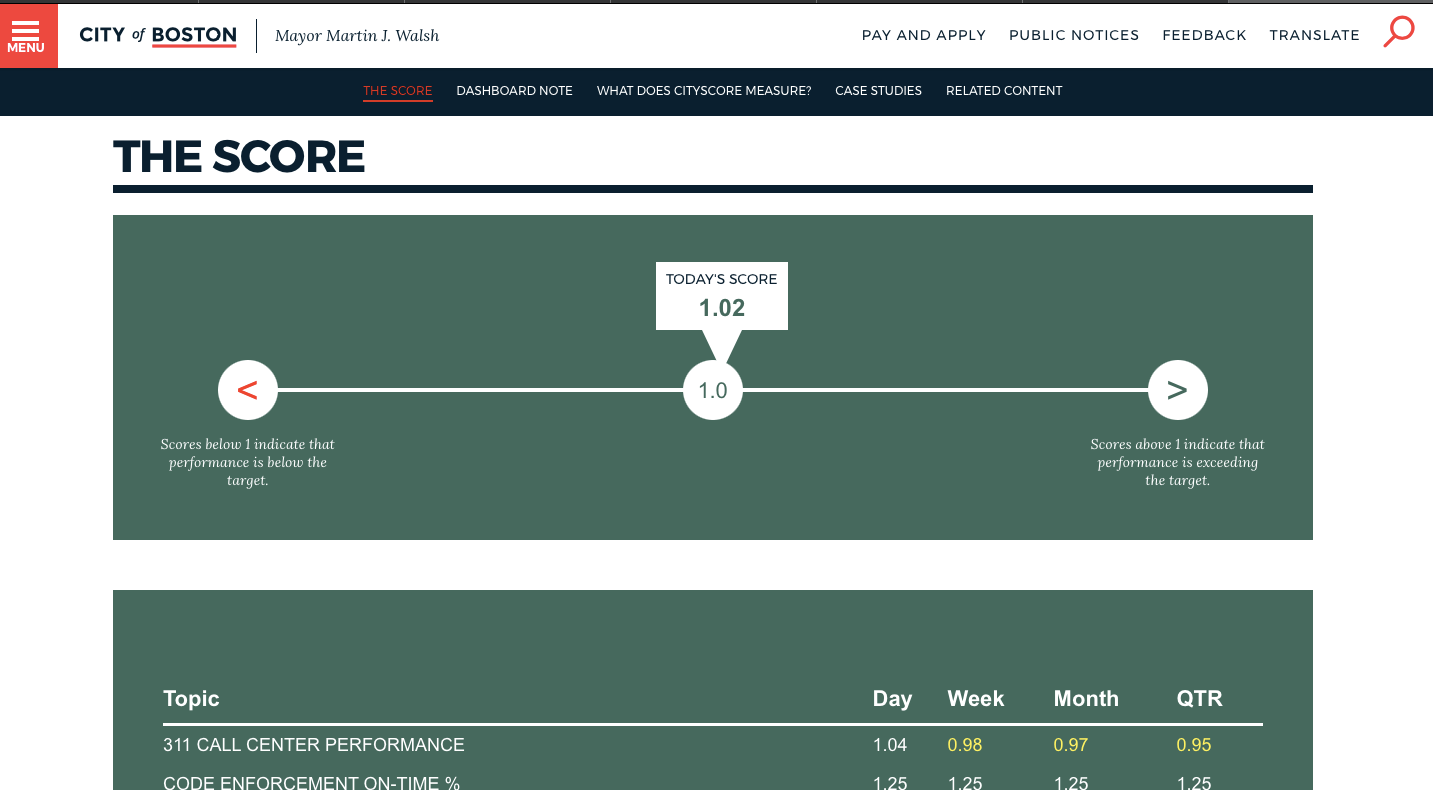
Above is a screen capture of CityScore's landing page, "What is CityScore" and, "How does it work" sections. At the initial meeting our stakeholders voiced the lack of engagement from constituents to the site.
We conducted a heuristic analysis and found the site was deficient in several of Nielsen's standars such as ensuring the product to be, findable, clear, communicative, useful, valuable and, delightful. Our respondents did not find the data to be displayed cohesively and yet were emotionally triggered by the statistics of emergency related incidents.
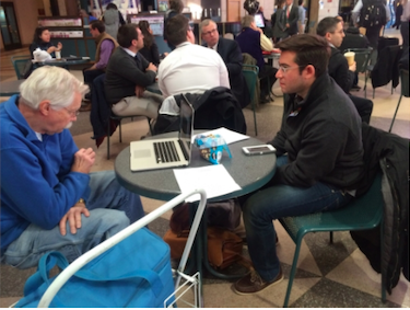
Research
During our first 24 hours we conducted an online survey and competitive analysis research to understand the quality of the information other city metric dashboards had in the country. Our stakeholders also provided us with the background on how the data each of their departments represented meant and the intent they wanted to convey to the users.
Stakeholders:

Co-lead and performance manager

Performance analyst

Content manager

City of Boston web designer

Tableau dashboard admin
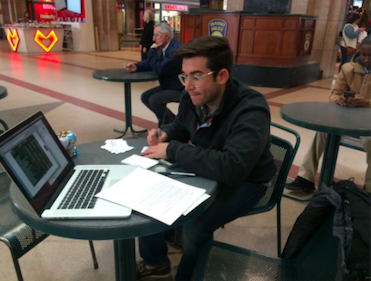
User Interviews
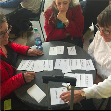
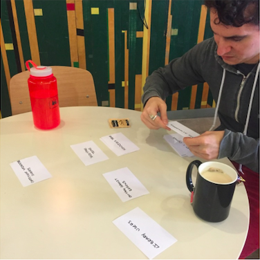
Card Sorting
Because the previous version of the dashboard displayed all of the data in one view, it was incoherent and difficult to find relevant information. Through input from both constituents and stakeholders, we sought to develop a more user friendly navigation structure.
Defining the problem
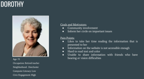
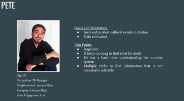
To synthesize our user research, we crafted two distinct personas to represent the types of Bostonians what would engage with the site.
Developing A Solution
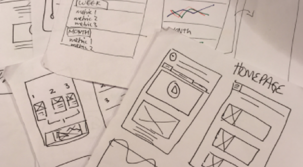
Early Iteration and Sketching
We conducted design studios with sketches to communicate how to prioritize features in a quick manner. Using our design goals and findings, my teammate and I quickly sketched low fidelity representations. Our sketches were analyzed together to determine the placement of content on our low fidelity wireframes.
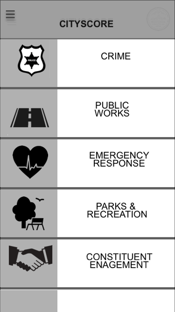
Testing templates on medium fidelity wireframes

Results 🙌🏼
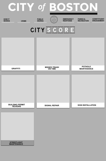
Transitioning from medium to high fidelity
These wireframes show the transition from our medium fidelity to high fidelity products. We then iterated several times over to based on the previous users feedbacks.
Selected Works
Principal Asset ManagementProject type
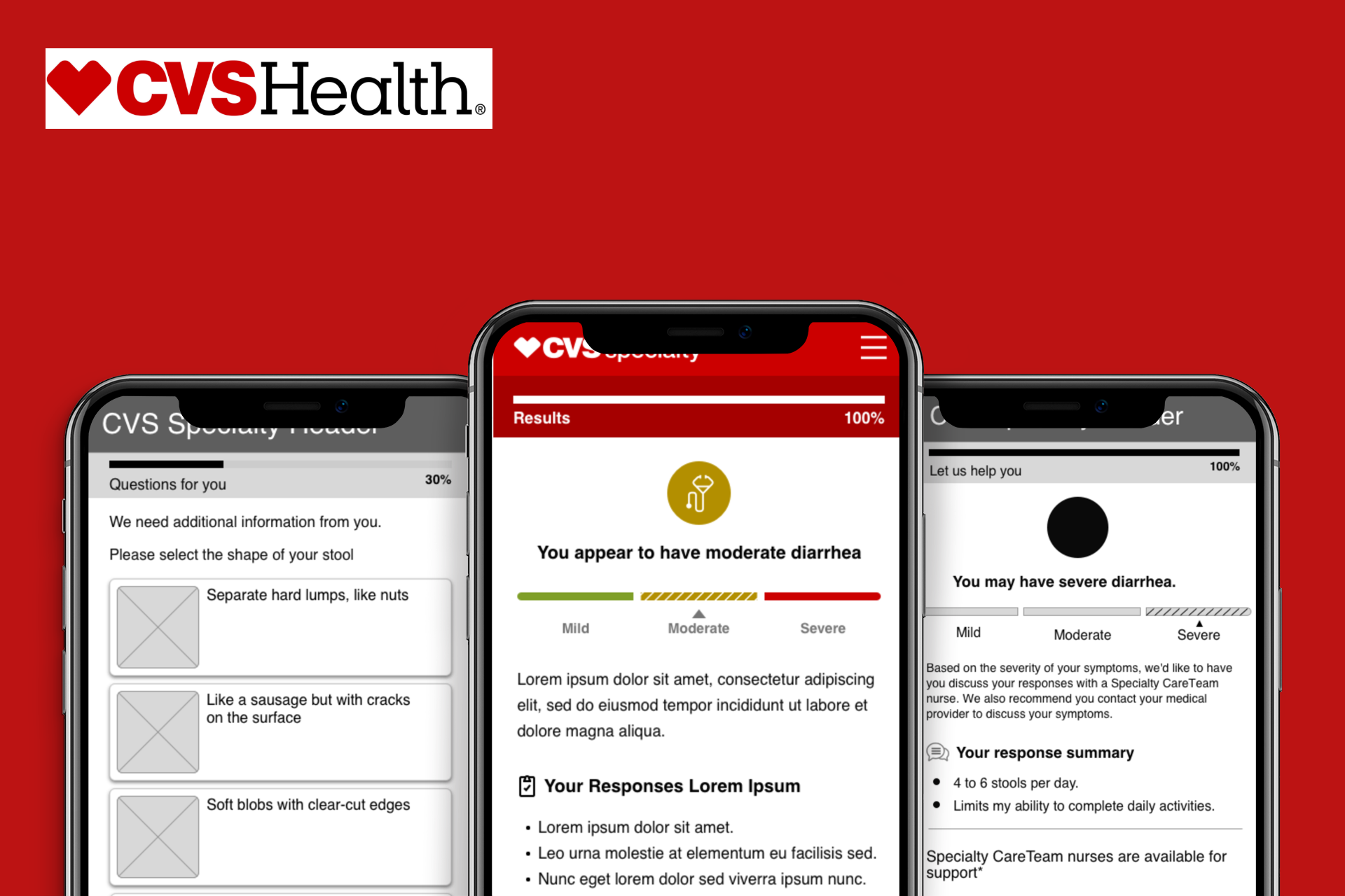
CVS's Symptom TrackerUX, UI, Research
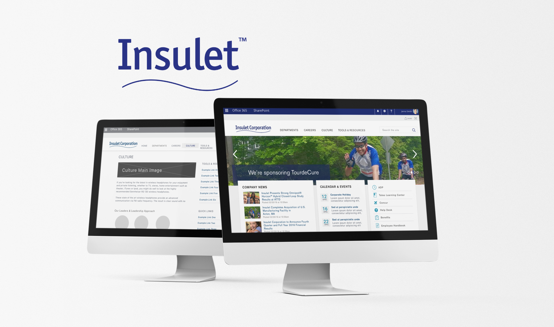
Insulet - My OmnipodUX, UI, Research
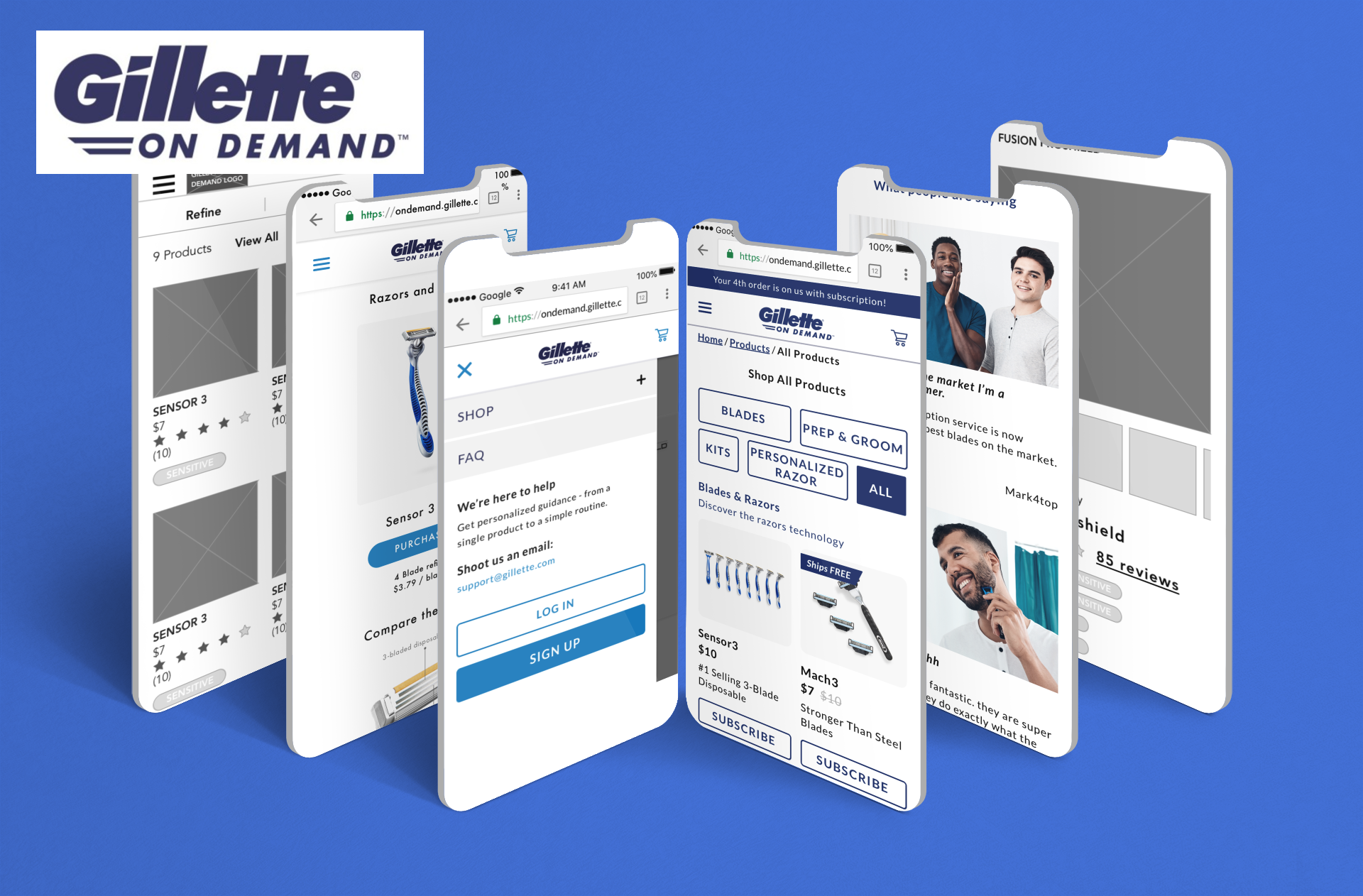
Procter and Gamble - GilletteUX, Research, Analytics
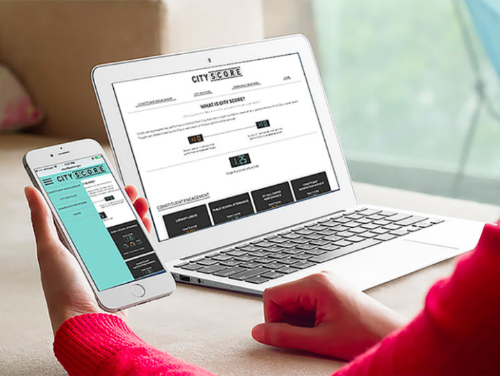
CityScore, Boston's City Performance MetricsProject type